Application Design 1 - Final Project: High Fidelity Prototype
22/07/2024 - 05/08/2024
Ng Zheng Kai 0359424
Bachelor of Design in
Creative Media
Application Design 1
Final Project
INSTRUCTIONS
Final Project
For this project, we are to create a high-fi prototype based on the feedback
from the lo-fi prototype usability testing.
Before starting the project via Figma, I used a website (https://colors.artyclick.com) to choose a suitable colour palette for the prototype.

|
| Fig 1.1 Colour Palette |
After that, I created a duplicate page from the lo-fi page and start to design
it.
I started to search for images relating to Firefly Airlines to implement on my
prototype. Simply pasting an image won't cut it, so I added an inner shadow
effect so that it fits better with the overall aesthetic of the app.

|
| Fig 1.2 Before inner shadow effect |

|
| Fig 1.3 After inner shadow effect |
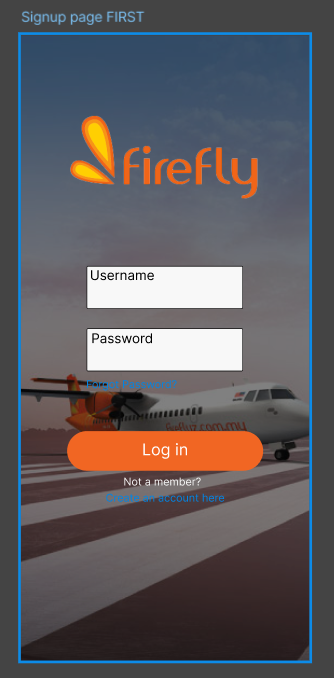
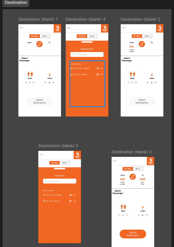
Then, I started to implement colours and images on the main menu and the
rest of the pages.

|
| Fig 1.6 Date selection page |

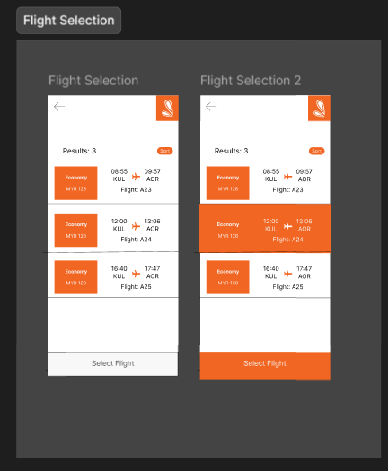
|
| Fig 1.7 Flight selection page |

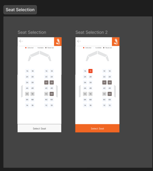
|
| Fig 1.8 Seat selection page |

|
| Fig 1.9 Review & payment page |

|
| Fig 1.10 Boarding pass page |

|
| Fig 1.11 Entire Hi-Fi Figma page |
Final Submission
Link to Figma file: https://www.figma.com/design/QAhEKlcEJVsMC4TMYJid5N/Prototype-(Firefly-Airlines)?node-id=243-253&t=6nIu4pWEdAOEJnJ1-1
Fig 1.12 Figma Preview
Fig 1.13 Hi-Fi Prototype
Fig 1.14 Video Walkthrough of Hi-Fi prototype
REFLECTION
As I embark on the journey of redesigning the Firefly Airlines App using
Figma, I find myself deeply immersed in the process of creating both
low-fidelity (lo-fi) and high-fidelity (hi-fi) prototypes. This project is
not just about developing a visually appealing and functional app but also
about enhancing my competencies in User Interface (UI) and User Experience
(UX) design, and reflecting on my individual performance for
self-improvement.
Reflecting on my journey, I can see substantial growth in my skills and
understanding. I have become more proficient in using Figma, but more
importantly, I have learned how to critically evaluate my work and seek
constructive feedback.


Comments
Post a Comment