Recap of Final Project brief
Students are to utilise their understanding of design principles found in the design work. This project requires the students to assess, investigate, document and analyse a design material (billboards/television commercial/movie clip/work of design) of their choice. They should notice, size, placement, purpose, effectiveness, as well as aspects of design principles found in that work.
Thereafter, they are to produce a work of design, inspired/influenced by the one they studied on, or as a reaction to it. They should also apply knowledge of design principles in their design.
Final Blog: It must contain all the work you have done and completed for this module, along with a final reflection.
PROGRESS: On the week you are working on a project, you are to discuss your progress with your lecturer.
Visual Analysis Requirements:
1. Pick one goal from United Nations’ Sustainable Development Goals (UNSDG).
2. Select an art/design work that revolves around the goal of your choice.
3. Explain, in about 50 words, why you chose that design and how it is related to that
UNSDG goal.
4. Write a 300- to 350-word visual analysis of the selected design (refer to Visual Analysis lecture notes).
5. Create a work of design of your own, inspired/influenced by/reacting to the one you had analysed.
6. Write a 50- to 100-word rationale explaining and defending the decisions made in your design.
In your FINAL PROJECT – VISUAL ANALYSIS post in the blog, include:
1. a recap of Final Project brief
2. your design process:
2.1 visual references (designs that have inspired your own)
2.2 idea exploration and description
2.3 final outcome JPEG (A4 size) and a rationale
2.4 feedback given by the lecturer
2.5 a reflection about what you have learnt and discovered from Final Project.
If you have any photographs as final submission or idea exploration, make sure that they are clear, taken from various angles and properly cropped.
Part 1: Visual Analysis
For Visual Analysis, I decided to choose Goal 2: Zero Hunger as my theme.
I decided to use this artwork, titled "Ying Yang of World Hunger" as my topic for visual analysis. This artwork is closely related to Goal 2: Zero Hunger because this artwork represents world hunger and the imbalance of human societies.
Phase 1: Observation
Firstly, this artwork is in a portrait format. As for visual elements, the main colours observed are black and white. Overall, It gives off a melancholic vibe. there is light coming from the top of the artwork and darkness on the bottom of the artwork. the centre consists of two people, with one person bigger than the other. (58)
Phase 2: Analysis
This artwork is symmetrically balanced, the emphasis is on the central image, which shows a big, obese white man with a remote controller on his left hand and a plate of pizza on his upper body, crushing the other person with his weight, the other person is a frail and sickly black man with a bloodied bandage on his shoulder, covering his face with his hand. There is a contrast in the artwork, the white person is brighter and more obvious than the black person. There is also a sense of scale, showing that the white person is much more larger than the black person. Finally, the artwork shows a circular movement similar to "Ying and Yang" but with the white more overpowering than the black. (126)
Phase 3: Interpretation
This artwork, named "Ying Yang of World Hunger", was made by a digital artist named Deevad, in 3rd September 2010, in order to support against world hunger. A large movement was created around this artwork with thousands of blogs and social websites sharing this visual message. I find that the artwork is closely similar to "Ying and Yang". Although "Ying and Yang" shows a sense of balance with the black and white interconnected and evenly distributed, Deevad's artwork however, shows that the white is overpowering the black, representing that there is enough food produced in the world to feed everyone, but the imbalance of human society results in the rich getting more food than they ever need, while the poor is dying due to their lack of food. (122)
Part 2: Design
Research and Idea Exploration
In my sketch, I wanted to include the shape of the "Ying and Yang" as a base, so I decided to make a planet Earth that are shaped similar to "Ying and Yang", one of the lands will be filled with rice or grain while the other lives a starving child. As for proportions, I was conflicted whether to make it equally distributed to show that there are two sides of the world or unproportionable to show that the situation on food distribution is unbalanced.
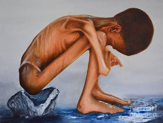
Final Outcome
So, this is my final design, inspired by Deevad's "Ying Yang of World Hunger". I tried a different approach by using planet Earth as the main object instead of two humans, but kept the shape of the Ying and Yang. In my design, our planet has two different lands separated by a pool of water, a grassland filled with an abundance of food and the another a barren wasteland with little to nothing to sustain oneself in order to survive.
Lecturer's Feedback
Self-reflection
I had fun doing this Final Project because it challenged me to interpret and analyze other's artwork, and also to create my own based on that.


Comments
Post a Comment