03/04/23 - 14/05/23, Week 1 - Week 6
Ng Zheng Kai/ 0359424
Bachelor of Design in Creative Media (HONS)
Typography GCD60104
Task 1: Exercise 1 & 2
LECTURES
Week 1
We were introduced to simple typeface in week 1, along with the assignment was briefed where we were tasked with creating typeface based on the letters.
Introduction to Typography
Font: The individual font or weight within the typeface.
Typeface: The entire family of fonts/weights that share similar characteristics/styles.
Typography: Development and Timeline
-Initially writing meant scratching into a wet clay with sharpened stick or carving into stone with chisel.
-The Greeks changed the direction of writing, wrote right to left. The Greek developed a style of writing called "boustrophedon" which meant the lines of text read alternately right to left and left to right
-Etruscan carvers working in marble painted letterforms before inscribing them. They drew it out with paint brush and developed the strokes based on the tools that they are using.
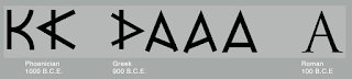 |
| Figure 1.1 Phoenician to Roman |
 |
| Figure 1.2 Evolution from the Phoenician letter |
 |
| Figure 1.3 Direction of writing for the Greeks, "boustrophedon" |
Text type classification
-1450 Blackletter : The earliest printing type, based upon the hand copying styles
-1475 Old style : Based on the lowercase forms used by Italian and the uppercase letterforms found inscribed on Roman ruins.
-1500 Italic : Condensed and close-set, allowing more words per page.
-1550 Script : Originally and attempt to replicate engraved calligraphic forms, not appropriate for lengthy text format.
-1750 Transitional : A refinement of old style form, achieve in printing and casting.
-1775 Modern : Serifs are unbracketed, and the contrast between thick and thin stroke extreme.
-1825 Square Serif / Slab Serif : Originally heavily bracketed serif, with little variation between thick and thin strokes, but the brackets dropped as evolved.
-1900 Sans Serif : Eliminated serif altogether
-1990 Serif/Sans Serif : Enlarge the notion of a family of typefaces to include both serif and sans serif alphabets.
Week 2
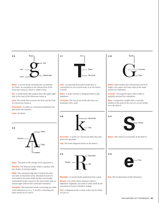
Typography: Basic / Describing letterforms
Baseline: The imaginary line the visual base of the letterforms.
Median: The imaginary line defining the x-height of letterforms.
X-height: The height in any typeface of the lowercase 'x'.
Stroke: Any line that defines the basic letterforms.
Apex/Vertex: The point created by joining two diagonal stems.
Arm: Short strokes off the stem of the letterform, either horizontal or inclined upward.
Ascender: The portion of the stem of a lowercase letterform that projects above the media.
Barb: The half-self finish on some curved stroke.
Beak: The half-serif finish on some horizontal arms.
Bowl: The rounded form that describes a counter, either open or close.
Bracket: The transition between the serif and the stem.
Cross bar: The horizontal stroke in a letterform that joins two stems together. ( eg. A H )
Cross Stroke: The horizontal stroke in a letterform that joins two stems together. ( eg. f t )
Crotch: The interior space where two strokes meet.
Descender : The portion of the stem of a lowercase letterform that projects below the baseline.
Ear: The stroke extending out from the main stem or body of the letterform.
Em: The distance equal to the size of the typeface (M space is gap between the word) / En : half the size of an em.
Finial: The rounded non-serif terminal to a stroke
Leg: Short stroke off the stem of the letterform, either at the bottom of the stroke ( eg L) or inclined downward ( eg K,R)
Ligature: The character formed by the combination of two or more letterforms. ( when f and i , finial clash)
Link: The stroke that connects the bowl and the loop of a lowercase G.
Loop: In some typefaces, the bowl created in the descender of the lowercase G.
Serif: The right-angled or oblique foot at the end of the stroke.
Shoulder: The curved stroke that is not part of a bowl.
Spine: The curved stem of the S ( 'S' is good for developing the skills, like curves).
Spur: The extension the articulates the junction of the curved and rectilinear stroke.
Stem: The significant vertical or oblique stroke.
Stress: The orientation of the letterform, indicated by the thin stroke in round forms. ( diagonal stress, Vertical stress: transition of copying handwriting.)
Swash: The flourish that extends the stroke of the letterform ( easily seen wedding, * never use swashes in capital letters together to form a word or a name)
Tail: the curved diagonal stroke at the finish of certain letterforms.
Terminal: The self-contained finish of a stroke without a serif.
The Font
The full font of a typeface has more than just letters, including numerals and punctuation marks. To effectively use type, it is important to have access to the full font and know how to use it.
Uppercase: Specific characters that are included as capital letters in a typeface, such as accented vowels, c cedilla, n tilde, and a/e and o/e ligatures.
Lowercase: Lowercase letters include the same characters as uppercase.
Small Capitals: Uppercase letterforms are drawn to the x-height of the typeface. Small Caps are commonly found in serif fonts as part of the expert set. Type software has a style command to generate small caps, but they should not be confused with real small caps.
Italic: A typeface style that slants the letters to the right, creating a cursive or calligraphic appearance. It is commonly used for emphasis, titles, and captions.
Punctuation, miscellaneous characters: To standard punctuation marks, different typefaces can have unique miscellaneous characters, so it's important to be familiar with all the characters available in a font before choosing it for a specific project.
Ornaments: Flourishes are used in invitations and certificates, and are usually part of a larger typeface family. Some traditional typefaces contain ornamental fonts as part of the family.
 |
| Figure 2.1 Punctuation and miscellaneous characters |
 |
| Figure 2.2 Ornaments |
Describing Typefaces
Roman: A classic serif font characterized by its upright, traditional letterforms with bracketed serifs.
Book: A medium-weight serif font commonly used for body text in printed materials.
Italic: Features slanted and stylized letterforms, often used to convey emphasis or contrast to the regular or Roman typeface.
Oblique: Slants the regular (upright) version of a font, without altering the letterforms.
Boldface: Variation that has thicker strokes than the regular version of the same typeface.
Light: A font weight that is thinner than the regular weight of a particular typeface.
Thin: Has a very light stroke weight and is often used for delicate or minimalist design purposes.
Condense: With narrow spacing between letters, allowing for more characters to fit in a given space.
Extended: The characters are horizontally stretched or widened compared to the regular version of the typeface.
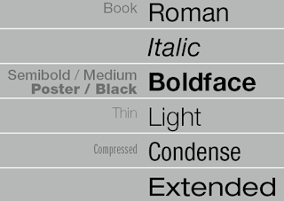 |
| Figure 2.3 Typefaces |
Week 3
Typography: Text
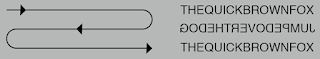
Kerning: Automatic adjustment of space between letters. Letter spacing means to add space between the letters.
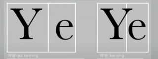 |
| Figure 3.1 Differences between kerning |
Tracking: adjusting the spacing between characters in a word or sentence and is typically used in large paragraphs of text.
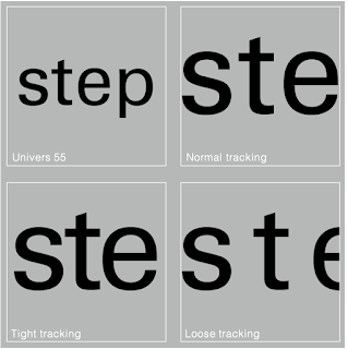 |
| Figure 3.2 Differences between tracking |
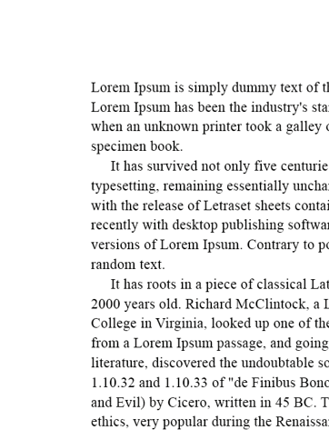
Formatting Text
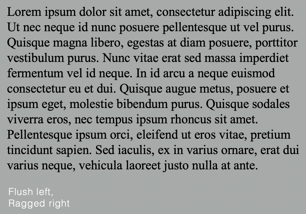
Flush left: Closely mirrors the asymmetrical experience of handwriting. Each line starts at the same point but ends wherever the last word on the line ends. Spaces between words are consistent throughout the text, allowing the type to create an even gray value.
 |
| Figure 3.3 Flush left |
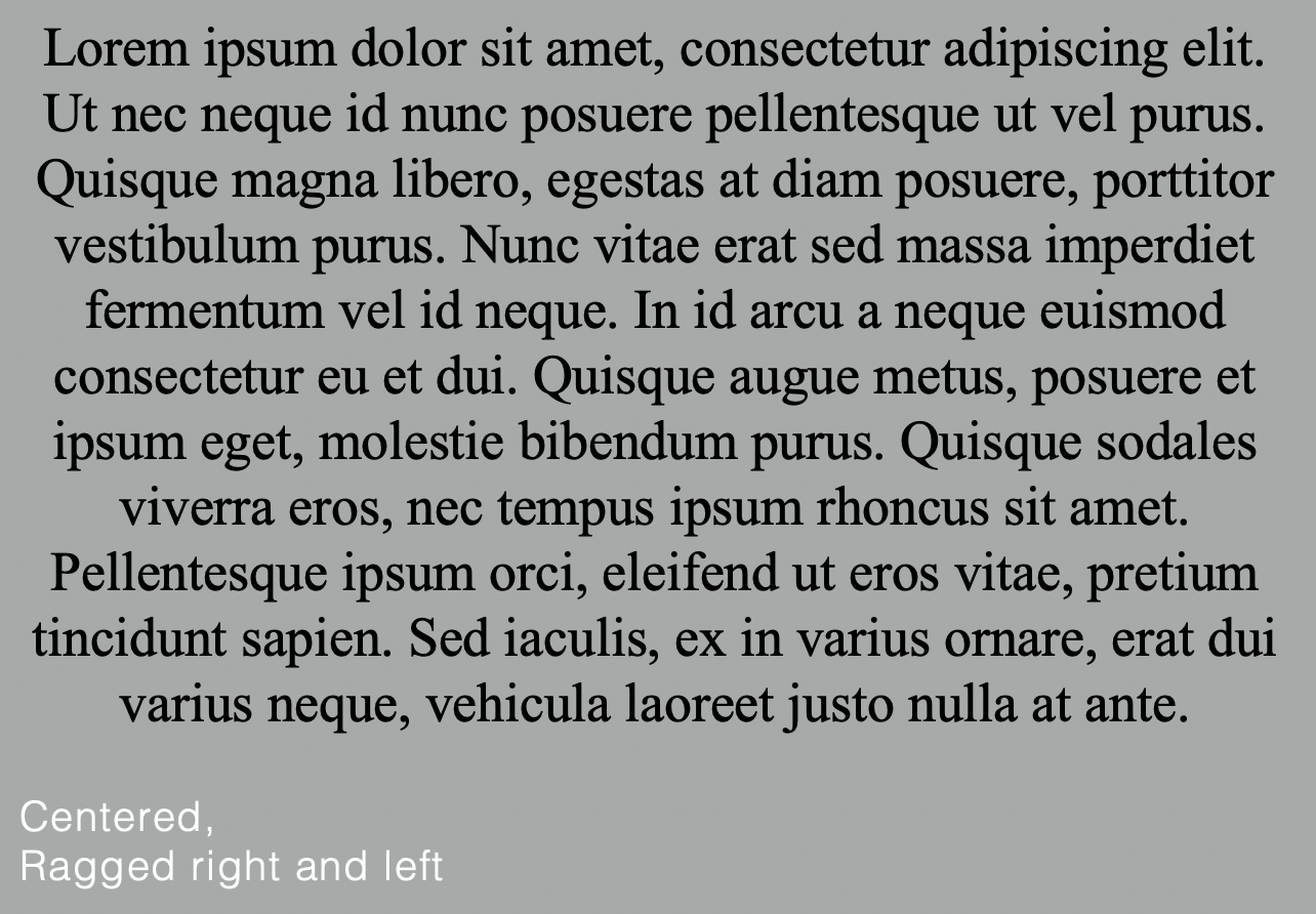
Centered: Imposes symmetry, equal value and weight to both ends of any line. It transforms fields of text into shapes, thereby adding a pictorial quality. Centered type creates such a strong shape on the page, it's important to amend line breaks so that the text does not appear too jagged.
 |
| Figure 3.4 Centered |
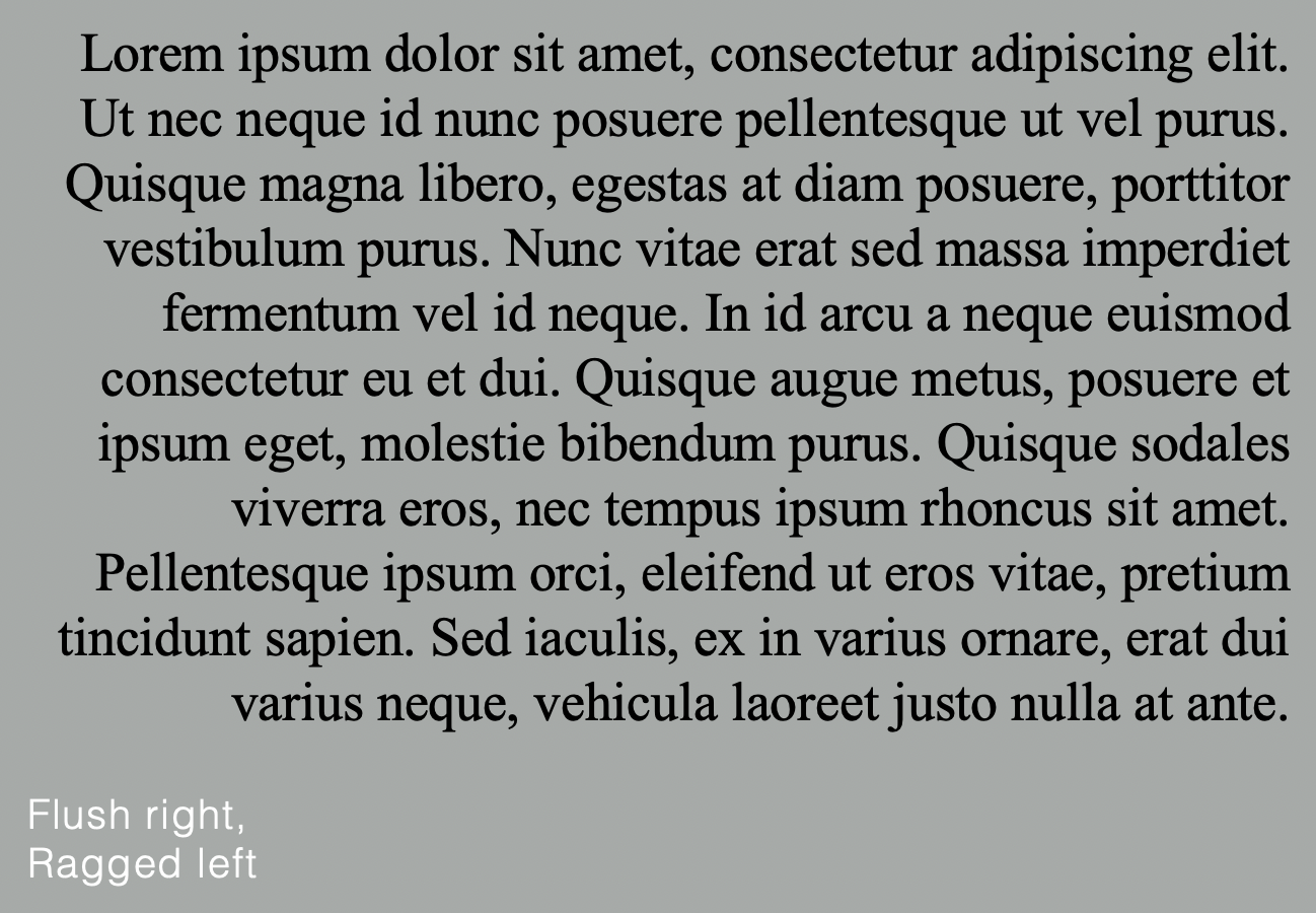
Flush right: Places emphasis on the end of a line as opposed to its start. It can be useful in situations (like captions) where the relationship between text and image might be ambiguous without a strong orientation to the right.
 |
| Figure 3.5 Flush right |
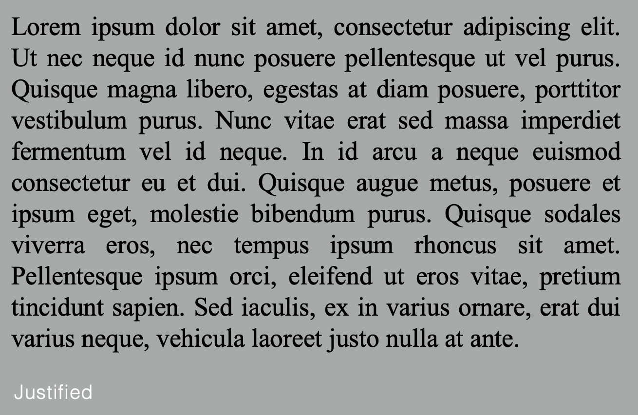
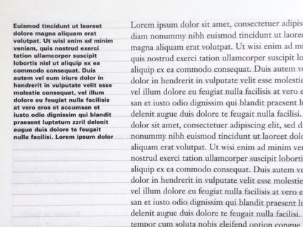
Justified: Imposes symmetrical shape on the text, achieved by expanding or reducing spaces between words and, sometimes, between letters. The resulting openness of lines can occasionally produce ‘rivers’ of white space running vertically through the text. Careful attention to line breaks and hyphenation is required to amend this problem.
 |
| Figure 3.6 Justified |
Texture
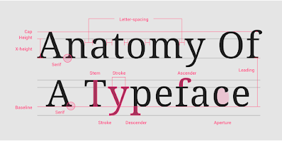 |
| Figure 3.7 Anatomy of a typeface |
Leading and Line length
Text size: Text type should be large enough to be read easily at arms length
Leading: Text that is set too tightly encourages vertical eye movement > easily loose his or her place.
Line Length: Appropriate leading for text is as much a function of the line length as it is question of type size and leading.
General rule: Keep line length between 55-65 characters.
Type specimen book
A type specimen book shows samples of typefaces in various different sizes. Its to provide an accurate reference for type, type size, type leading, type line length, etc.
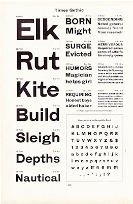 |
| Figure 3.8 Type specimen sheet |
Week 4
Indicating paragraph
Pilcrow (¶): A holdover from medieval manuscripts seldom use today.
Line space (leading*): Between the paragraphs. If the line space is 12pt, then the paragraph space is 12pt. This ensures cross-alignment across columns of text.
Standard indentation: Indent is the same size of the line spacing or the same as the point size of the text.
Extended paragraphs: create unusually wide columns of text.
 |
| Figure 4.1 Standard indentation |
 |
| Figure 4.2 Extended paragraph indentation |
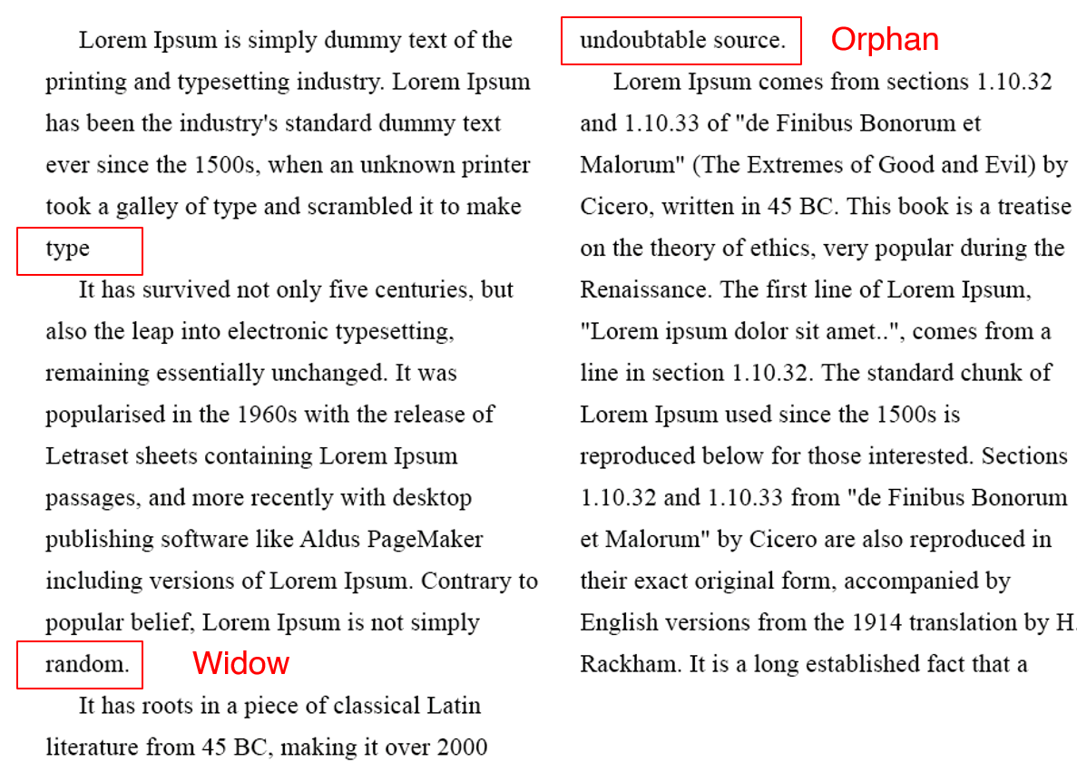
Widows and orphans
Widow: Short line of type left alone at the end of a column of text.
Orphan: Short line of type left alone at the start of a new column.
 |
| Figure 4.3 Widows and orphans |
Highlighting text
-Quotation marks: creates a clear indent, breaking the left reading axis.
-Bold
-Highlight with different colour
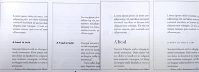
Headline within text
A head: indicates a clear break between the topics within a section.
 |
| Figure 4.4 A heads |
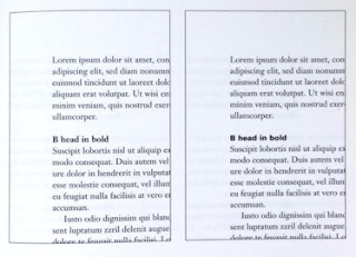
B head: subordinate to A heads. B heads indicate a new supporting argument or example for the topic at hand. As such they should not interrupt the text as strongly as A heads do. Here the B heads are shown in small caps, italic, bold serif, and bold san serif.
 |
| Figure 4.5 B heads |
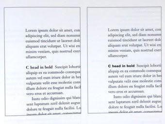
C heads: highlight specific facets of material within B head text. They don't interrupt the flow of reading. C heads in this configuration are followed by at least an em space for visual separation.
 |
| Figure 4.6 C heads |
Cross-alignment
Cross aligning: headlines and captions with text type reinforces the architectural sense of the page (the structure) while articulating the complimentary vertical rhythms.
 |
| Figure 4.7 Cross-alignment |
Week 5
Understanding letterforms
Baskerville stroke form shows two distinct stroke weights, and each bracket connecting the serif to the stem has a unique arc.
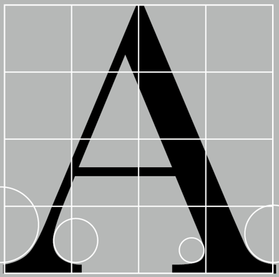 |
| Figure 5.1 Baskerville "A" |
Univers: a popular typeface with a consistent design across a range of weights and styles, making it easy to use and maintain legibility at small sizes.
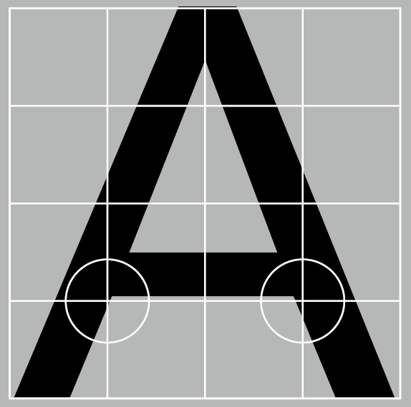 |
| Figure 5.2 Univers "A" |
Maintaining x-heightX-height: The size of the lowercase letterforms. Curved strokes, such as in ‘s’, must rise above the median (or sink below the baseline) in order to appear to be the same size as the vertical and horizontal strokes they adjoin.
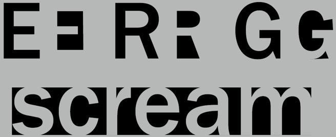
Form/ counterform
Form/counterform: The space describes, and often contained, by the strokes of the form. When letters are joined to form words, the counterform includes the spaces between them. Proper handling of counters when setting type is important for ensuring words hang together well and are easily readable.
 |
| Figure 5.3 Form/Counterform |
Contrast
Contrast: To differentiate different types of information.
 |
| Figure 5.4 Contrast |
Week 6Print type VS Screen type
Good typefaces for print: Caslon, Garamond, Baskerville.
Because of their characteristics which are elegant and intellectual but also highly readable when set at small font size.
 |
| Figure 6.1 Type for print |
Screen typefaces are optimized and modified to improve readability and performance on digital environments through taller x-height, wider letterforms, open counters, and reduced stroke contrast.
For typefaces intended for smaller sizes, use more open spacing, in order to improve character recognition and overall readability in the non-print environment, which can include the web, e-books, e-readers, and mobile devices.
 |
| Figure 6.2 Type for Screen |
Hyperactive Link/ hyperlink: clickable elements like words, phrases, or images that you can click on to jump to a new document or a new section within the current document. Found in nearly all Web pages. Text hyperlinks are normally blue and underlined by default.
Font Size for screen: 16-pixel text on a screen is about the same size as text printed in a book or magazine; this is accounting for reading distance. Because we read books pretty close — often only a few inches away — they are typically set at about 10 points. If you were to read them at arm’s length, you’d want at least 12 points, which is about the same size as 16 pixels on most screens.
System Fonts for Screen/Web Safe Fonts: Open Sans, Lato, Arial, Helvetica, Times New Roman, Times, Courier New, Courier, Verdana, Georgia, Palatino, Garamond.
Static VS Motion
Static typography: minimal characteristics in expressing words. Traditional characteristics such as bold and italic offer only a fraction of the expressive potential of dynamic properties.
Motion typography: often used in music videos and ads, moving to the rhythm of the soundtrack, and establishing the tone or conveying brand values. In title sequences, it prepares the audience for the film's mood.
INSTRUCTIONS
EXERCISE 1: Type expression
For Exercise 1, we are given a set of words to create type expressions of. The words I have chosen are Pause, Split, Party, Love and Silence. No graphical elements are allowed, we are limited to only 10 typefaces which are Adobe Caslon Pro, Bembo, Bodoni, Futura, Gill Sans, Garamond, New Baskerville, Janson, Serifa and Univers.
Sketch
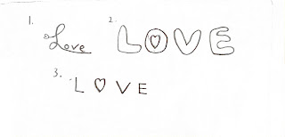 |
| Figure 1.1 Sketch 1: Love |
In Love#1, I wrote it in cursive, with a little heart shape on the start of the word L. In Love# 2, I replace the circle inside the word O with a heart shape. In Love#3, I replaced the entire O with a heart shape.
 |
| Figure 1.2 Sketch 2: Split |
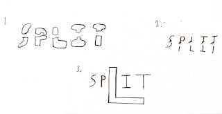
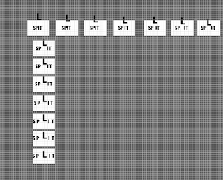
In Split#1 and Split#2, I split the word Split horizontally. In, Split#3, I enlarge the word L and separate the words S,P and I,T.
 |
| Figure 1.3 Sketch 3: Silence |
In Silence#1, I wrote the word Silence but with each word smaller in size than the previous, to symbolize sound getting silent. I did the same thing in Silence#2, but more compacted. In Silence#3, I drew a wavy line in the end of the word to signify the emptiness of silence.
 |
| Figure 1.4 Sketch 4: Party |
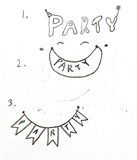
In Party#1, I drew a party cone on the word P and a balloon on the word Y. In Party#2 I drew a smiley face and the word Party on their teeth. In Party#3, I drew small flags and with each word for Party on each flag.
 |
| Figure 1.5 Sketch 5: Pause |
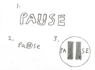
In Pause#1, I drew a pause symbol and a smiley face to replace the word U. In Pause#2, it is the same thing but with a circle pause button. In Pause#3, I drew a big pause button and include the words inside the circle.
Digitisation
After Mr Vinod's feedback, the words I decided to digitize are Pause#1, Split#3, Love#2, and Silence#3.
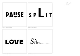 |
| Figure 1.6 Final Type Expression |
Figure 1.7 Final Type Expression PDF
Type animationI decided to animate the word Split. Initially, I used 28 frames and exported it using a resolution of 300 ppi, but it proved too big to be made into a GIF, so I reduced the amount of frames to 14 and reduced the resolution to 36 ppi, which are based on Mr Vinod's video.
 |
| Figure 2.2 Frames used for the GIF |
Final Design.gif) |
| Figure 2.3 Final design for Split.gif |
EXERCISE 2: Text FormattingExercise 2 involves creating a layout that demonstrates various text formatting techniques, including kerning, leading, paragraph spacing, alignment, and more. This exercise aims to enhance our ability to organize information spatially and create effective hierarchies. Adobe InDesign is the software to be used for this exercise.
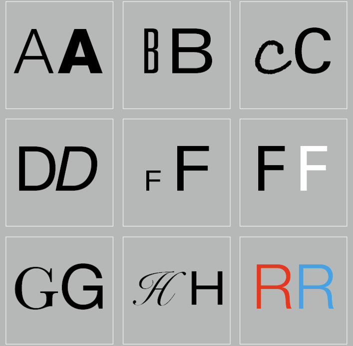
I started by testing out the 10 different typefaces allowed to use in Adobe Indesign.
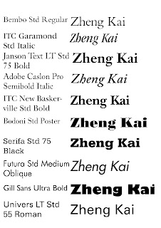 |
| Figure 3.1 Various types and fonts |
Kerning and trackingI made sure to set my kerning and tracking increments to 5/1000 em before starting my text formatting.
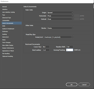 |
| Figure 3.2 Set Kerning and tracking to 5 |
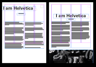
Figure 3.3 shows the initial layout with no kerning and trackings.
 |
| Figure 3.3 Initial text with no adjustments |
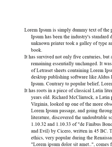
Figure 3.4 shows the difference of text layout without kerning and with kerning.
 |
| Figure 3.4 Without kerning (left) and with kerning (right) |
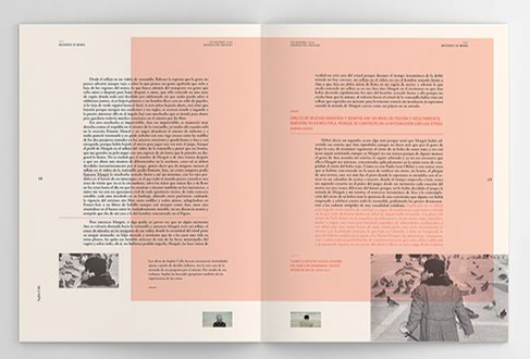
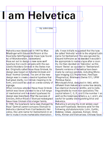
Final text formatting layout
HEAD
Font/s: Univers LT Std 65 Bold
Type Size/s: 60 pt
Leading: 72 pt
Paragraph spacing: 0
BODY
Font/s: Univers LT Std
Type Size/s: 9 pt
Leading: -15 pt
Paragraph spacing: 11 pt
Characters per-line: 56
Alignment: left
Margins: 12.7 mm top + inside + outside, 100 mm bottom
Columns: 2
Gutter: 4.233 mm
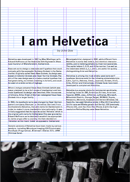 |
| Figure 3.5 Final design with grids and guides visible |
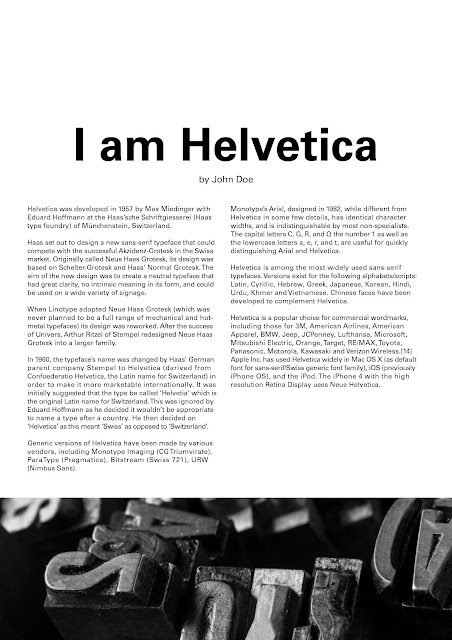
Figure 3.6 Final design
|
Figure 3.7 Final Text Format with grids visible
|
Figure 3.8 Final Text formatting PDF
FEEDBACKQuestions:
1. Are the explorations sufficient?
2. Does the expression match the meaning of the word?
3. On a scale of 1–5, how strong is the idea?
4. How can the work be improved?
Week 1
General feedback: The blog is neatly built
Week 2
General feedback: photo of sketch should be taken in better lighting
Specific feedback: Split: "L" splits other words works, others also works
- Love: "O" with heart in the middle is good
- Pause: overall good
- Party: too graphical
- Silence: 3rd one could work, if the words get smaller.
Week 4
General feedback: Leave the GIF still in the end for 2-3 seconds to prevent looping.
Week 5
TEXT FORMATTING QUESTIONS
1. Is kerning and tracking appropriately done?
2. Does the font size correspond to the line-length, leading & paragraph spacing
3. Is the alignment choice conducive to reading?
4. Has the ragging been controlled well?
5. Has cross-alignment been established using base-line grids?
6. Are widows and orphans present?
General feedback: Do not use italic, bold for entire body paragraphs. Add spacing might solve widows. Submit text format with guides and grids visible.
REFLECTION
Experience
This exercise has taught me the basics of typography such as typefaces, fonts, letterspacings, cross-alignments and many more, it also taught me how to create designs for letters digitally, and how to animate a basic GIF.
Observations
I have observed that there are many complex elements within letters that the average joe would ignore, such as cross alignment, kerning, line lengths, raggings and so on.
Findings
I came to appreciate typography even more now, as when I read articles or books, I start to notice the page layout and the alignment of the words even more than before.
FURTHER READING
Based on the few books recommended in the list, I read the book, "Typographic design: Form and communication"
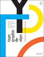 |
| Figure 4.1 Typographic design: Form and communication |
Reference:
Carter, R., Day, B., Meggs, P. B., Maxa, S., & Sanders, M.
(2015). Typographic design: Form and communication.
Hoboken, New Jersey: John Wiley & Sons, Inc.
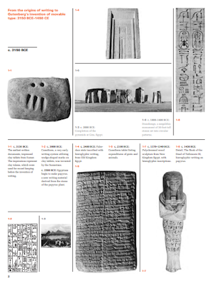 |
| Figure 4.2 Chapter 1: The Evolution of Typography, page 2 |
The book starts in introducing the early days of typography, like impressed clay tablets, hieroglyphics and so on.
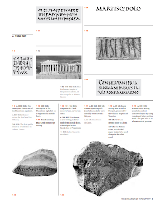 |
| Figure 4.3 Chapter 1: Evolution of Typography, page 3 |
Various kinds of alphabets were formed as time moves on.
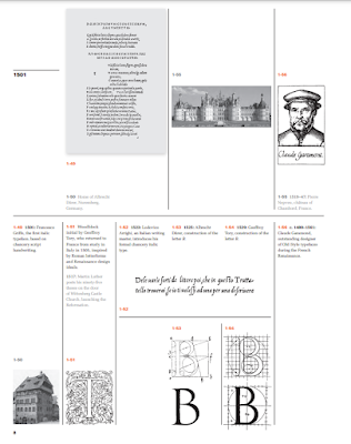 |
| Figure 4.4 Chapter 1: Evolution of Typography, page 8 |
The letter "B" was created in 1525 by Albrecht Dürer.
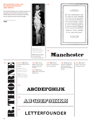 |
| Figure 4.5 Chapter 1: Evolution of Typography, page 12 |
The industrial revolution made a huge impact in typography as new machines were being invented, and new forms and images were created.
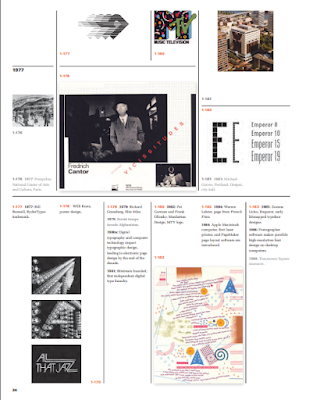 |
Figure 4.6 Chapter 1: Evolution of Typography, page 24
|
As technology continued to evolve, so too did typography as digital typography were being created.
 |
| Figure 4.7 Chapter 2: The Anatomy of Typography, page 33 |
Other than the history and evolution of typography, the book also does a dissection on letterforms. It showed various major components of letterform construction, such as ascender, apex, hairline, link, stem and many more.


.gif)


Comments
Post a Comment