21/9/2023 - 7/11/2023, Week 5 - Week 11
Ng Zheng Kai / 0359424
Advanced
Typography / Bachelor of Design in Creative Media (Hons)
Task 2: Key
Artwork and Collateral
LECTURES
All lectures are completed in
Task 1
INSTRUCTIONS
Task 2A: Key Artwork
Sketch
For my key artwork, I am going for a graffiti bubble style font. Because I want to give off a sense of a chill and friendly vibe for my key artwork.

|
|
Fig 1.1 Sketch
|
Digitalize

|
|
Fig 1.2 Image Trace
|

|
|
Fig 1.3 Word Digitalization
|
Color Palette
 |
| Fig 1.4 Color Palette |
For my color, I decided to choose a bright and vibrant color palette.
Final Design

|
|
Fig 1.5 Final Design (JPG) (B&W)
|

|
|
Fig 1.6 Final Design (JPG) (Colour)
|
Fig 1.7 Final Design (PDF) (B&W)
Fig 1.8 Final Design (PDF) (Colour)
Task 2B: Collateral
For my collaterals, I decided to put my key artwork on a bag, a beanie and a shirt.
Collateral #1 Bag

|
|
Fig 1.9 Bag design
|
Collateral #2 Beanie

|
|
Fig 1.10 Beanie design
|
Collateral #3 Shirt

|
|
Fig 1.11 Shirt design
|
Final Task 2: Key Artwork and Collateral

|
|
Fig 2.0 Final Key Artwork (B&W)
|

|
|
Fig 2.2 Final Key Artwork (Colored)
|

|
|
Fig 2.3 Final Key Artwork (Colored)
|

|
|
Fig 2.2 Final Animated
|

|
|
Fig 2.3 Collateral #1
|

|
|
Fig 2.4 Collateral #2
|

|
|
Fig 2.5 Collateral #3
|

|
|
Fig 2.6 Instagram Desktop
|
Fig 2.6 Final Designs (PDF)
FEEDBACK
Week 6:
General Feedback: Good color scheme
Specific Feedback: Try to be more creative with the collaterals
Week 5:
General Feedback: (Absent)
Week 4:
General Feedback: Find a good meaning as to why I chose to design
it this way
Specific Feedback: The graffiti style could work, need some
refinements on the spacings
REFLECTION
Experience
In this assignment, I struggled a few times mainly because I was initially confused and was also busy with other assignments, but I eventually did came up with a key artwork that I liked.
Observation
I have noticed that the color of the words and the background plays an important role in creating this key artwork.
Findings
Through this project, I have found that it is important to have a clear sense of direction when designing, as the design must have a meaning and a clear rationale so that it may lead to further expansions.
FURTHER READING
 |
| Fig 2.7 Typography Referenced |
 |
| Fig 2.8 Introduction |
The book covers the basics of typography, its history, and commonly used fonts.
 |
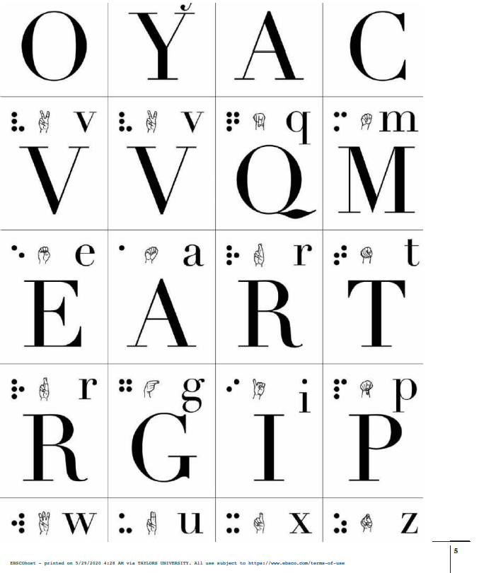
| Fig 2.9 Linotype Didot, Braille and sign language of the English Alphabet |
 |
| Fig 2.10 Tools and Concepts |
The book also shows various tools used throughout history in creating typefaces. For example, a various of nips were used as the angle is required for Indian penmanship.
 |
| Fig 2.11 Reading Direction and Scanning |
Designers often use a focal point that guides the reader's eye from the top-left corner. In such designs, the designer takes charge, directing the reader to the initial point of focus. This technique is used in our Task 1 assignment.


Comments
Post a Comment