Advanced Typography- Task 3: Type Exploration and Application
25/10/2023 - 29/11/2023, Week 9 - Week 14
Ng Zheng Kai / 0359424
Advanced
Typography / Bachelor of Design in Creative Media (Hons)
Task 3: Type
Exploration and Application
LECTURES
All lectures are completed in
Task 1
INSTRUCTIONS
Task 3: Type Exploration and Application
In Task 3, we have the choice to choose and lead our own project. We can
either create a font to address a specific challenge within our chosen field
(such as Graphic Design, UI/UX, Animation, Entertainment Design, or any other
area) or investigate the application of a font within our field of interest.
The final result will be the implementation of the designed font in various
formats relevant to the problem or exploration at hand, including but not
limited to animation, 3D, print, ambient displays, projection, movie titles,
game titles, and the use of diverse materials.
Research and Ideas
Fig 1.1 Proposal
Font Exploration

|
| Fig 1.2 Fonts that inspired me |
Hip Hop culture has always fascinated me because I liked how liberating it
is, it encourages individuals to express their creativity in various forms.
Whether it's through lyrics, dance, or graffiti art, hip-hop encourages
self-expression and originality.
That is why I decided to further explore some existing graffiti typefaces,
understand its details, and add my own touch into it.

|
| Fig 1.3 Further font exploration |
I plan to further explore the typeface "Another Tag" (https://www.dafont.com/a-another-tag.font)
The typeface mainly consist of sharp edges on top and inconsistent sizes
between letters.

|
| Fig 1.4 Another Tag |

|
| Fig 1.5 Exploring brush strokes |
In Fig 1.5, I used Adobe Illustrator to play around with different brush
strokes to find a suitable candidate for my own typeface. In the end, I
decided to go with a brush stroke that is just right in its thickness and
strokes.
|
| Fig 1.6 Initial attempts (Part 1) |
|
| Fig 1.7 Initial Attempts (Part 2) |

|
| Fig 1.8 Initial Attempts (Part 3) |

|
| Fig 1.9 Initial Attempts (Part 4) |
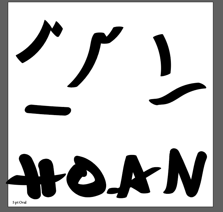
I used the brush stroke to draw out all the uppercase letters without caring about sizes and baselines at first, so to get a sense of what typeface I am about to create.

|
| Fig 1.10 Inconsistent brush strokes |
The problems I keep on facing is that the thickness of my brush stroke is
sometimes inconsistent even though I am using the same brush stroke. So, I
have to readjust some of the letters manually to make the thickness
consistent.

|
| Fig 1.11 Created letters with no reference to baseline (Part 1) |
|
|
| Fig 1.12 Created letters with no reference to baseline (Part 2) |
After finishing all the letters, I then make duplicates of it and readjust
the sizes according to the baseline.
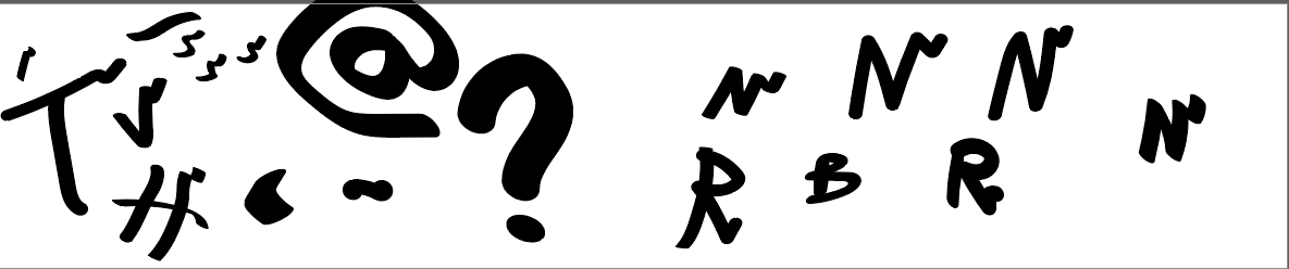
The feedbacks given by Mr Vinod are mostly inconsistent thicknesses between letters and inconsistent style with the punctuations ,so I had to do further readjustments.

|
| Fig 1.13 All letters readjusted and refined according to the baseline |
The feedbacks given by Mr Vinod are mostly inconsistent thicknesses between letters and inconsistent style with the punctuations ,so I had to do further readjustments.

|
| Fig 1.14 Feedbacks on created letters |

|
| Fig 1.15 Final readjustments |
Generating the font in Fontlab 8
After transferring all my letters from Adobe Illustrator to Fontlab 8, I
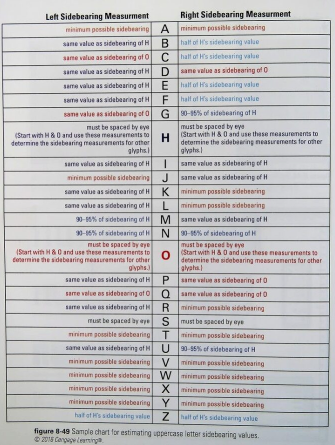
adjusted the side bearings of all my letters according to the guide provided
by Mr Vinod. For uppercase side bearings, I have to first adjust the letter
"H" and "O" using only my eye, then readjust the other letters according to
these two letters. While for the lowercase side bearings, I have to first
adjust the letters "n" and "o" before adjusting the other lowercase letters.
|
| Fig 2.1 Uppercase side bearing guide |

|
| Fig 2.2 Lowercase side bearing guide |
|
|
| Fig 2.3 Uppercase letters with adjusted side bearings |
|
|
| Fig 2.4 Lowercase letters with adjusted side bearings |
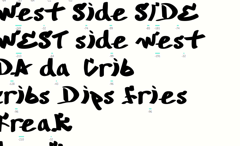
After adjusting my side bearings, I then type out a few words to readjust my kernings.
|
| Fig 2.5 Readjusted kernings |
Font file link: https://drive.google.com/file/d/1XE1XDU-ZvI0Uf23LaIC5WIeiQKSIIEoA/view?usp=drive_link
Type Presentation
I created my font presentation using Adobe Illustrator, I used different
colours and strokes on my newly created typeface to create a sense of variety
and be more vibrant.

|
| Fig 3.1 First page |

|
| Fig 3.2 Second page |

|
| Fig 3.3 Alphabets showcase (Part 1) |

|
| Fig 3.4 Alphabets showcase (Part 2) |

|
| Fig 3.5 Alphabets showcase (Part 3) |

|
| Fig 3.6 Numericals showcase (Part 1) |

|
| Fig 3.7 Numericals showcase (Part 2) |

|
| Fig 3.8 Punctuations showcase (Part 1) |

|
| Fig 3.9 Punctuations showcase (Part 2) |
Type Application
For font application, I initially wanted to created a hip hop dance
competition poster and wrist bands, but Mr Vinod advised me to use 5 different
walls instead.

|
| Fig 4.1 Initial Designs |
Mr Vinod recommended me to change the opacity of my letters to multiply so
that it can better blend in with the walls and to also make it realistic. He
also taught me to cut my the letters into multiple sections to make it look
more jagged so that it gives off a realistic graffiti on a brick wall sense of
aesthetic.

|
| Fig 4.2 Normal view |

|
| Fig 4.3 Outline view |
Final Application designs

|
| Fig 4.4 Application 1 |

|
| Fig 4.5 Application 2 |

|
| Fig 4.6 Application 3 |

|
| Fig 4.4 Application 4 |

|
| Fig 4.5 Application 5 |
Final Task 3: Type Exploration and Application
-01.jpg)
|
| Fig 5.1 Final type design (JPG) |
Fig 5.2 Final type design (PDF)
Fig 5.3 Final font presentation (PDF)
Fig 5.4 Font application (PDF)
Font Preview
FEEDBACK
Week 8
ILW
Week 9
General Feedback: State your goals clearly in blog
Specific Feedback: Find a better reference picture for graffiti
Week 10
General Feedback:
Specific Feedback: Adjust the stroke thickness to maintain
consistency
Week 11
General Feedback: Uppercase is good, lowercase needs some more
work
Week 12
General Feedback: The background should not be overly complicated
Week 13
Specific Feedback 1: For application, use different walls and use
overlays on typeface to blend with the wall texture.
Specific Feedback 2: In Type Presentation, enlarge only 1 punctuation
and make others small.
Specific Feedback 3: Make spray paint smaller and make typeface more
obvious.
REFLECTION
Experience
In this assignment, I find it to be fun as I get to express my own style in
the vast graffiti font world, even though sometimes it might be tedious and I
always face the same thickness inconsistency problems. But it was worth it
once my creation came to my life in the form of wall art. I am just glad and
relieved that it looked like a legitimate graffiti font in the end.
Observation
I found out that maintaining consistency between all letters is quite
challenging, especially for graffiti styles fonts. It is also time consuming
to create a typeface covering the whole alphabet, punctuations and numbers.
Findings
Throughout the whole assignment, I feel that I am much more confident than I
was before when creating a new typeface. Although my created typeface might
not be highly refined, I was able to learn and utilize the full use of
creating a typeface in Fontlab 8.
FURTHER READING

|
| Fig 6.1 A type Primer |
This book offers a clear and easily understandable narrative. It provides a touch of historical background along with numerous practical examples, accompanied by detailed explanations. Additionally, its appealing design enhances the overall learning experience. It is a book recommended for beginners.

|
| Fig 6.2 Spaces (page X) |
There is plenty of "spaces" involved in typography, such as, the space inside
the form, between forms, between words, between lines, between paragraphs,
between columns of text, and between text and the edges of the page.

|
| Fig 6.3 Reinforcing meaning (pg 64) |
This page is a reminiscence of an assignment that we did back in Typography, simple choices in typeface, size, weight, and position can strengthen the representation of the concept of the word.


Comments
Post a Comment