Typography Task 3: Type Design and Communication
24/5/2023 - 29/6/2023 / Week 8 - Week 13
Ng Zheng Kai / 0359424
Typography
/ Bachelor of Design (Hons) in Creative Media
Task 3A: Type Design and
Communication
LECTURES
All lectures 1 to 6 completed in
Task 1: Exercise 1 & 2
INSTRUCTIONS
For task 3A, we are to design the letters a e t k g r i y m p n
The purpose of this project is for us to learn how to create a good typeface,
with subtlety, character, presence, legibility and readability in mind.
Upon completion of the font, we were to create a poster displaying our created
font. Software: Adobe Illustrator, Fontlab 7.
Task 3: Type Design and Communication
Research on type design

|
| Figure 1.1 Anatomy of Typography |
Type design has to adhere to the typography guidelines such as baseline, median, ascender and descender, as well as typography basics pictured in Fig. 1.1 above. While creating our sketches we should be aware of these.
Baseline- The line where all characters sit.
Median- The height of lowercase letters without ascenders.
Ascender- The upward part of the letterform that extends above the
x-height and usually above the cap height.
Descender- The downward vertical stroke that extends below the
baseline.
Sketches
The first part of the assignment requires 5 different writing tools, writing
horizontal, vertical, diagonal , circular lines, and the letters AOTMX using 5
different ways.
The tools I had chosen are: cotton bud, highlighter, Calligraphy pen 1.0,
water based brush sign pen and Fine Line 1.2.
Figure 1.2 All five tools
After that, the next part requires us to write down the letters "a e t k g r i
y m p n", using the same 5 tools with the selected way.

|
| Figure 1.3 All 5 tools in selected ways |
Based on the feedback given by Mr Vinod, he suggested that I use the #4 water
based brush sign pen, but he also told to be aware of the letters, as they
need to be sitting on the baseline. Afterwards, I proceeded to use the water
based brush sign pen to practice writing the same letters in my chosen style.

|
| Figure 1.4 Practice |
Digitalization
After satisfied with the outcome of my sketch, I used Adobe Illustrator to
digitalize my sketch.
First, I had to create a 1000pt x 1000pt layout. After that, I had to create a
guidelines ascender line, cap line, mean line, base line, and descender line,
as instructed by Mr Vinod.

|
|
Figure 1.5 Guidelines |
After finished setting up the guidelines, I proceeded to created a custom brush stroke that is similar to my sketch.

|
| Figure 1.6 Custom made brush stroke |
Then, I proceeded to create my initial digital design of my typeface using the custom brush stroke that I created.

|
| Figure 1.7 Initial designs |
After creating my initial design, Mr Vinod pointed out that the angle of my strokes are inconsistent, so he advised me to use the pen tool to draw out a straight line, and use the shape tool to draw a circle, then apply my custom brush on them. He also instructed us to create the symbols " . , ! # ".

|
| Figure 1.8 Lines and circular shapes |
I then used these lines and shapes to recreate my letters, in order to produce a more consistent angle and thickness.

|
| Figure 1.9 Comparison between unrefined (top) and refined (bottom) letters |
|
|
| Figure 1.10 Final design |
Developing the final font in Fontlab 7
After finishing my design in Adobe Illustrator, Mr. Vinod instructed us to
develop our final font in Fontlab 7. I made sure to fill in the correct font
information (ascender, descender, x-height) in the "Font Info" tab before
pasting the letters from Illustrator.

|
| Figure 1.11 Setting up font information |

|
| Figure 1.12 Importing letters |
After importing the letters from Illustrator to Fontlab 7, I made sure that
both my sidebearings are 50, as instructed in the video.
|
|
| Figure 1.13 Setting all bearings to 50 |
Then, I began adjusting the kerning of to allow proper spacing between the letters.

|
| Figure 1.14 all letters and symbols used |
After adjusting the kernings for all the letters, I exported the font and installed it in my laptop.
Poster Design
I used ChatGPT to let it come up with a sentence using the letters " a, e,
t, k, g, r, i, y, m, p, n"

|
| Figure 1.15 Using ChatGPT as reference for making a sentence |
Although ChatGPT used other letters apart from the ones I gave, it still gave me some ideas and inspiration in creating my poster.
By using some sentences made by ChatGPT, I came up with my own sentence and
made the poster.

|
| Figure 1.16 Poster Design |
Final Outcome
|
|
| Figure 1.17 Task 3: Type Design and Communication "Natcore" in JPEG |
|
| Figure 1.18 Screen grab of "New Metrics Window: with sentence |

|
| Figure 1.19 Poster Design in JPEG |

|
| Figure 1.20 Poster Design with Background in JPEG |
Figure 1.21 Poster Design in PDF
Figure 1.22 Poster Design with Background in PDF
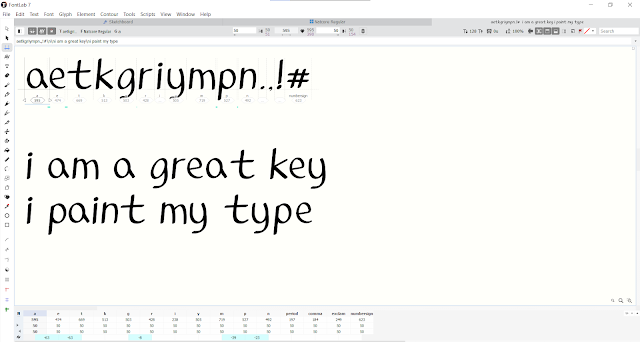
Font preview:
FEEDBACK
Week 8
General Feedback: Independent learning week
Specific Feedback: Mr Vinod prefered the writing using the water
based brush sign pen, but my letter's descenders need to be sitting on the
baseline.
Week 10
Specific Feedback: make more refinements on the letters.
Week 11
Specific Feedback: Use shapes and pen tool to draw, then press the
selection and press brush that I created. Use cut tool to remove excess
areas.
REFLECTION
Experience
In task 3, we get to create our own typeface from scratch. I think it was a
fun experience as I felt joyful when I first typed a sentence using the
typeface that I made.
Observations
When designing a typeface, I discovered that we must make sure that the
typeface is consistent as each letter needs to have the same stroke, angle and
thickness.
Findings
In the process of creating my own typeface, I found that creating a typeface
requires paying close attention to details like ascenders, descenders,
x-height, median, baseline, kerning, etc.
FURTHER READING

|
| Figure 2.1 Typography Basics |
|
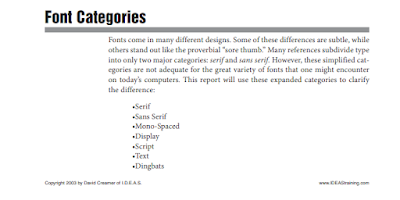
| Figure 2.2 Font categories page 1 |
The first page of the book "Typography Basics" covers various types of font categories, such as serif, sans serif, mono-spaced, display, script, text, and dingbats.

|
| Figure 2.3 Display and Script |
The categories that caught my eye are display, scripts, text, and dingbats.
Display- fonts that are designed to be used as attention-getting
headline fonts, rarely used as body fonts
Scripts- fonts that are designed to mimic handwriting, they are
designed to touch one another. Often used for formal invitations, should never
be used in all capital letters.

|
| Figure 2.4 Text |
Text- Have an "old world" feel to them. Mostly used for certificates,
diplomas and invitations. Should not be used in all capital letters.

|
| Figure 2.5 Dingbats |
Dingbats- symbols that are used to enhance the design of the text or
page.


Comments
Post a Comment